Better.co.uk (formerly Trussle)
February 2022 – August 2024
Redesigning a UK mortgage funnel, one tested stage at a time
In the growth team of a UK online mortgage broker, I redesigned five stages of the funnel. Each new stage beat the old design in an A/B test.
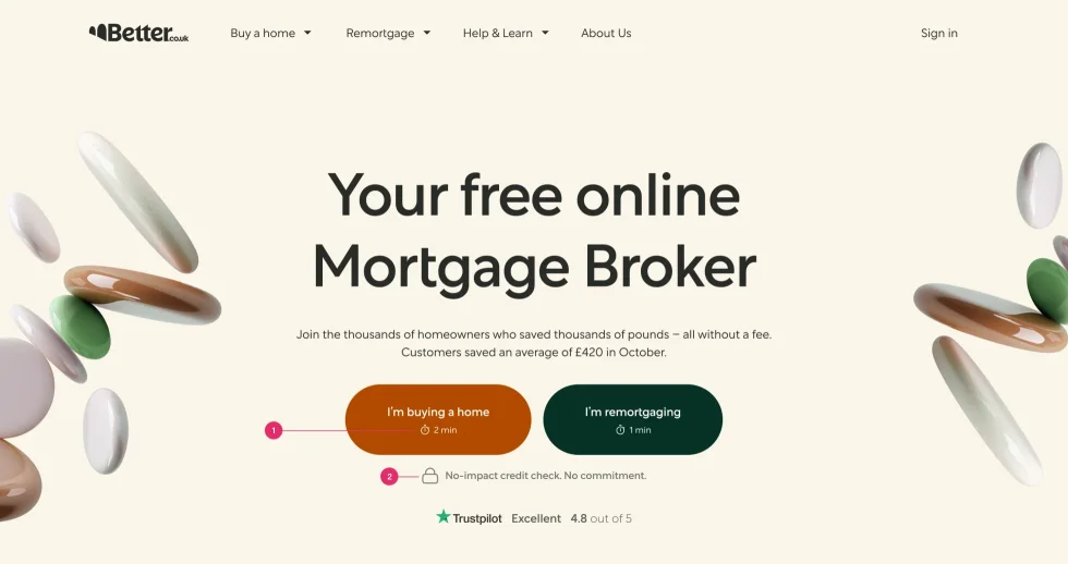
+11%
best tested stage against the old design
9%
of sign-ups enter the new small-loan flow
+6%
contact rate after the customer portal
~50
pages on Better’s design system in two weeks
Context
Trussle was a UK online mortgage broker, regulated by the FCA, the UK financial regulator. Better.com bought it in 2021, and in December 2022 it became Better.co.uk. I joined in February 2022 as the product designer in the growth team.
The problem
A mortgage is sold on the phone, so the website has to bring people to an adviser’s call. People dropped out at known points: a long application form, fear of a credit check and a long wait for the call. The business also ignored loans under £80k, because it saw them as unprofitable. After the acquisition, every page also had to move onto Better’s design system.
What I did
Five funnel stages, each tested against the old design
I redesigned five stages of the funnel, from the homepage to document upload. Each new design ran against the old one in a long A/B test in Optimizely, and each one won. I also checked the flows in usability tests, from moderated sessions to five-second tests.
Tests also decided the details. I redesigned the homepage navigation after a card-sorting study, and A/B/C tests chose the headline and the button labels. An A/B test showed that a “Get started” button confused people about where to click, so we removed it. For the hottest leads, the short first form brought the adviser’s call before the long application form.
| Stage | Against the old design | What I changed |
|---|---|---|
| Visit → sign-up | +1.8% | The homepage, a short first form, a page before sign-up |
| Sign-up → lead | +3.1% | Sign-up, an application form 30% shorter, the customer portal |
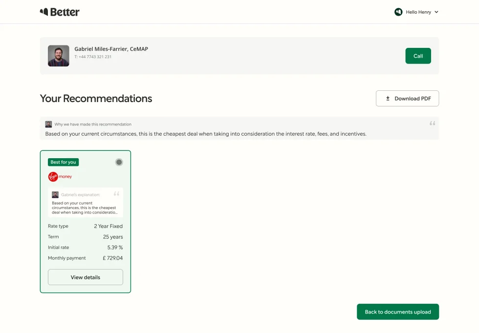
| Lead → recommendation | +11% | The recommendation page |
| Recommendation → accepted | +7.6% | Choosing and accepting a product |
| Accepted → documents sent | +2.9% | Document upload |
A flow for small loans that the business had ignored
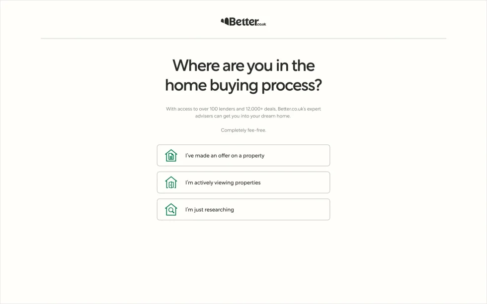
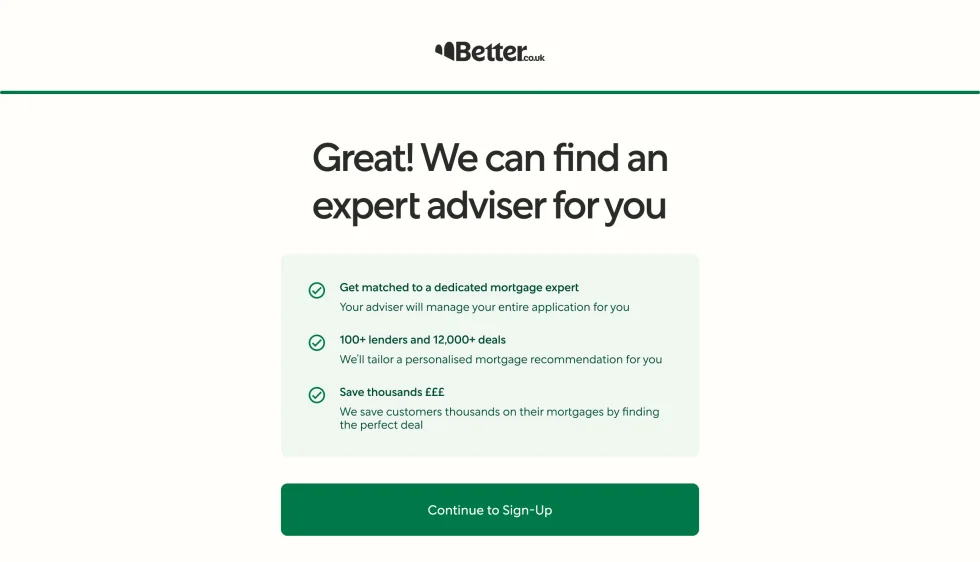
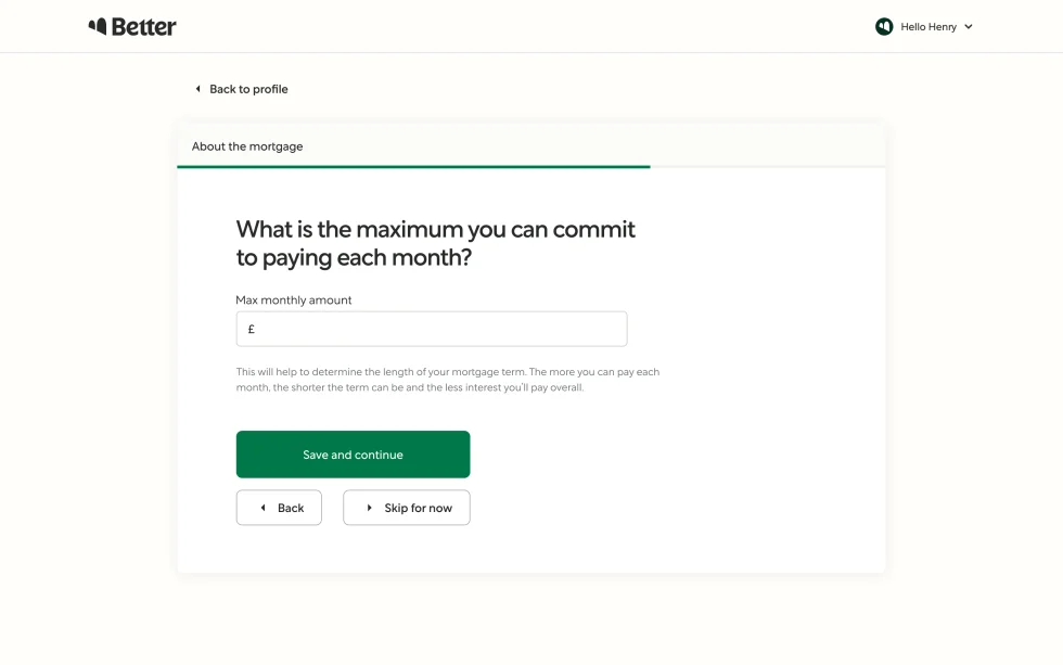
Loans under £80k had no flow of their own, because the business saw them as unprofitable. I designed a low-contact flow for them, where clients pick deals online and send them for review. Now 9% of sign-ups become leads in this flow, and 68% of these leads accept a product. The company serves these clients with very few resources.
A customer portal for the wait before the call
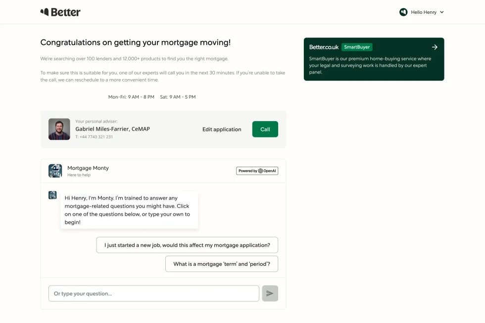
After applying, clients used to wait for the adviser’s call on a thank-you page. I designed a customer portal for this wait: when the adviser will call, who the adviser is, and the application itself. Its AI assistant runs on OpenAI’s GPT-3.5, answers from our learning centre articles and has limits on what it may answer. I designed the chat and its suggested questions. The assistant explained mortgage terms and the next steps, but it gave no personal advice and quoted no rates. For those questions, it sent the client to their adviser, and the Call button stayed next to the chat. The contact rate rose 6%.
Moving about 50 pages onto Better’s design system in two weeks
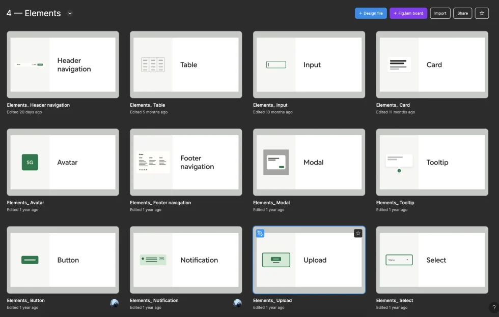
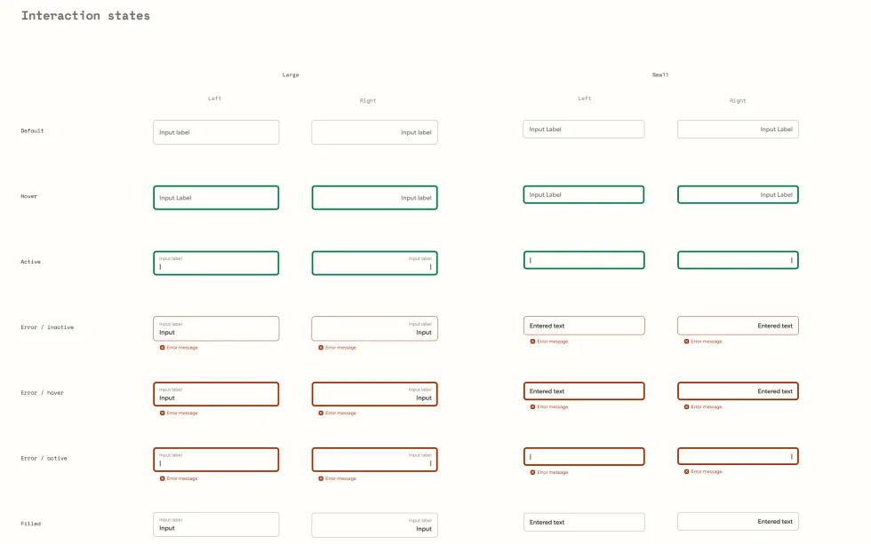
Better.com handed over its design system: a large library in Figma, with a copy in Storybook for engineers. Before that, Trussle kept its components in three places: Storybook, Figma and one-off pages. In two weeks I moved about 50 pages onto the new system, from the landing pages to the whole journey after sign-up. Some UK parts had no match in the US system, such as address search by postcode and the risk warnings that the FCA requires. I designed them in Better’s style and agreed each one with Better’s design team. I kept the funnel itself as it was, because only the brand and the company behind it had changed.
Results
- Each redesigned stage beat the old design, by 1.8% to 11%.
- 9% of sign-ups now enter the small-loan flow, and 68% of these leads accept a product.
- The contact rate rose 6% after the customer portal launched.
- Advisers got fewer simple questions before the first call, because the assistant answered them.
- After the move, landing pages and tests took less design time, and marketing got many more components.
Who did what
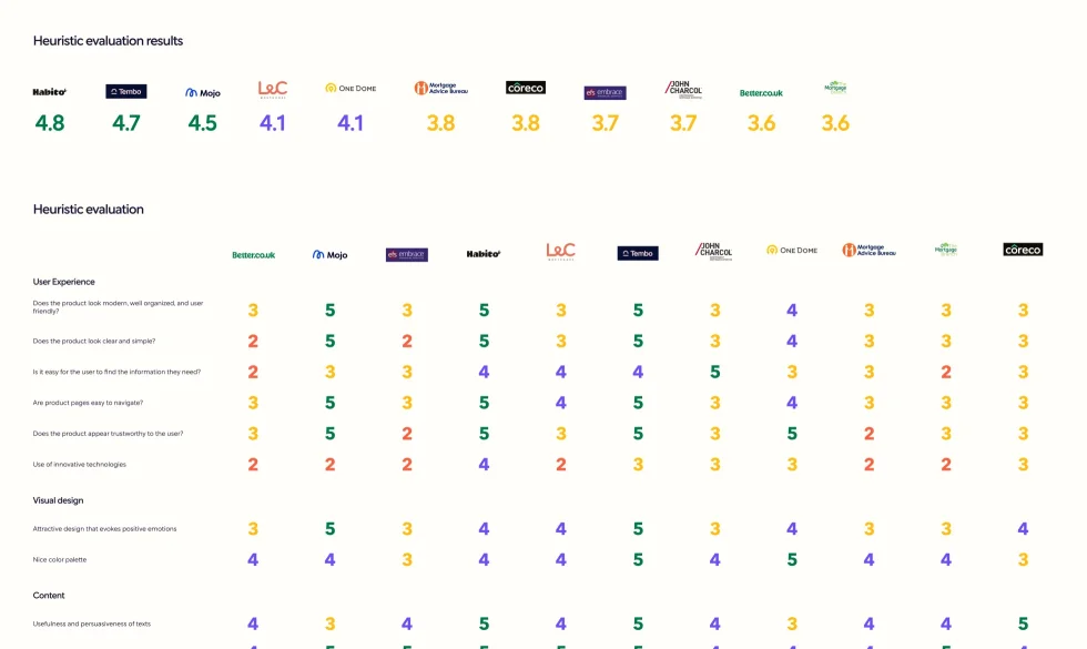
- Me: the five funnel stages, the small-loan flow, the customer portal, the benchmark and the move to the new design system.
- Product owners and the Head of Product: the hypotheses and their priority.
- An analyst and the tech lead: reading the test results.
- Better’s design team: the design system itself. I agreed every new UK component with them.
- Growth team engineers: built the new flows and connected the assistant to OpenAI.
What I learned
- A mortgage is sold on the phone, so the website’s job is to prepare people for that call.